
Introduction
Accessibility in PowerPoint presentations is crucial because it ensures that all audience members, including those with disabilities, can share in understanding the content. When creating a presentation, applying structures and features for accessibility is not just a technical requirement, but a reflection of your commitment to equal access to information.
Applying accessibility features such as Alternative Text for images, clear and readable fonts, adequate colour contrast, and proper structural formats for lists, tables, etc., reflects the commitment to inclusivity and enhances overall effectiveness of the presentation by reaching a broader audience.
Having an understanding of the accessibility features and capabilities of PowerPoint is beneficial for effective communication of the slides for individuals with disabilities. When we work through projects with accessibility features in mind from the beginning, we save time in future adjustments/corrections necessary for passing validators/checkers.
Designing Accessible Slides
Consider some of the following for effective design of accessible slides:
- Although there are search options for accessible templates, don’t assume all theme/presentation templates available within the program already have accessibility in mind. If choosing a theme, look for ones with strong colour contrast and simplified backgrounds.
- Understanding the chosen colour pallet and whether combinations of foreground (colour of things like text and images) and background (color of slide background or area behind text) pass colour contrast checkers before designing the layout help ensure accessibility as the presentation is being formatted.
- Consider some of the most accessible font sizes and style choices for the presentation. If you are noticing the slide is heavy with content, causing a font size of less than 10 or 12, consider moving some information to a secondary slide to offset for better legibility.
- Avoid overly complex and decorative font choices when keeping accessibility in mind and choose a font from the Sans Serif family.
- When it comes to creation, start by ensuring Master slides are formatted to complement the features in PowerPoint that allow an easier read for an end user. If brandmarks are inserted, ensure ALT is added. If background images/section line break graphics are incorporated for visual use only, consider setting them as decorative. Apply appropriate reading order within the slides for the elements. Also choosing layouts that incorporate slide “titles” at the top as a placeholder will ensure proper descriptive text for a screen reader and end users navigation of the slides.
- Moving into creation of the presentation slides, the Reading Order of elements should follow the intended flow of the presentation. Screen readers will navigate the Reading Order Pane. Scattering text boxes around the slide can create an improper understanding of the flow of the information if the Reading Order is not structured. Further, always remember when updating a slide – if a new element was added, it may appear at the bottom of a Reading Order pane. Adjustments to a slide should be double-checked so that accessibility items applied aren’t dropped or faltered.
- Proper structural formats for lists, tables, table of contents, and further formats are more recognised through screen readers.
- Tables – Simple structures are best for PowerPoint accessibility. Simplified tables are most comprehensible for screen readers. The more instances of merged columns within a table can make it difficult to navigate and correlate child data cells to their associated parent heading cell, whether it be a row or column.
Incorporating Accessible Multimedia
Incorporating videos within the PowerPoint presentation? Have you ensured closed captioning or subtitles are available for those videos (either in PowerPoint for Windows or encoded into the video before insertion into the presentation)? Closed captioning/subtitles allow everyone, regardless of hearing ability, level of visual impairment, or environment, to have an understanding of the videos included in the presentation. Further, many studies show closed captioning of a video improves comprehension and memory of that video.
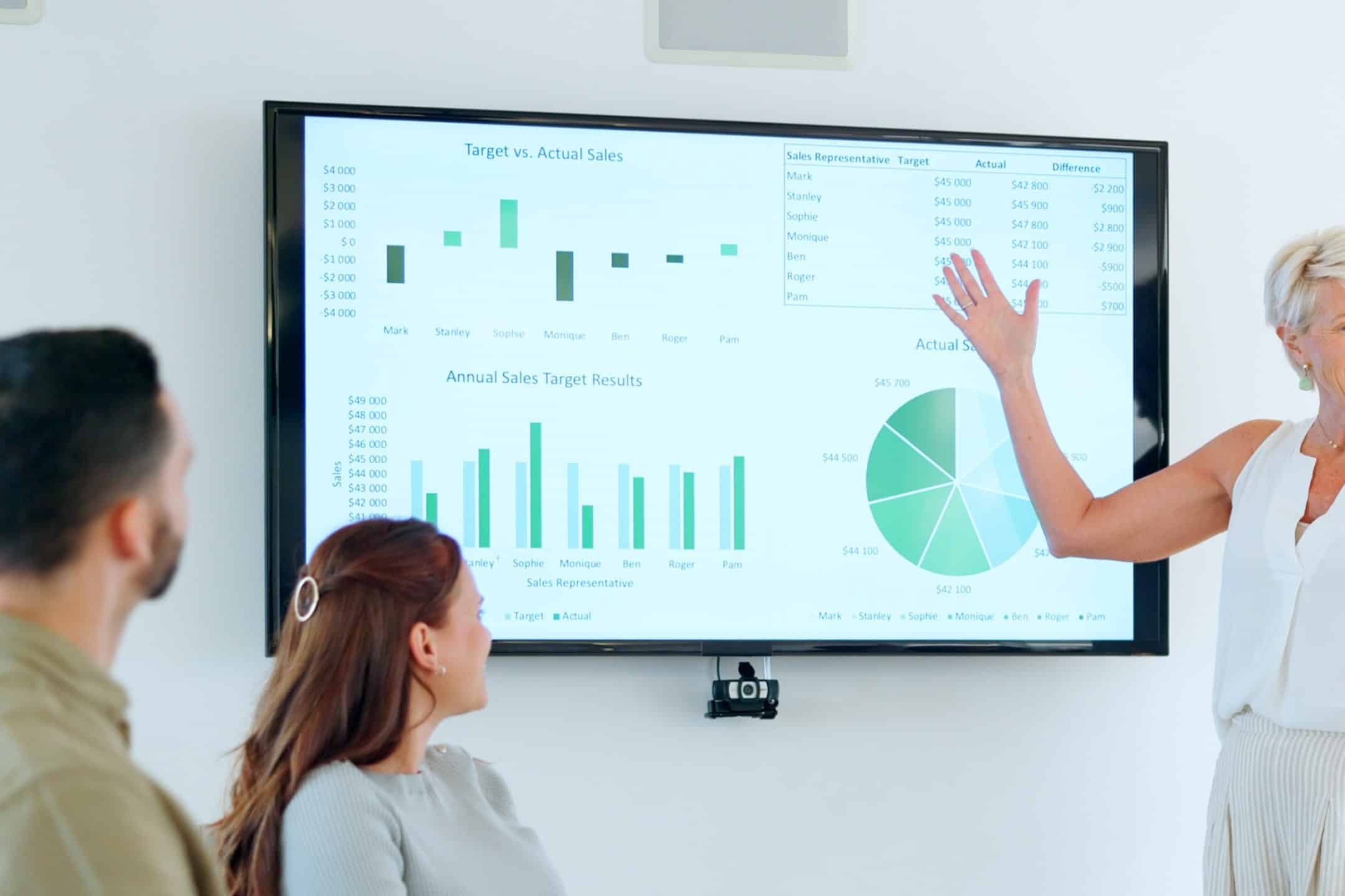
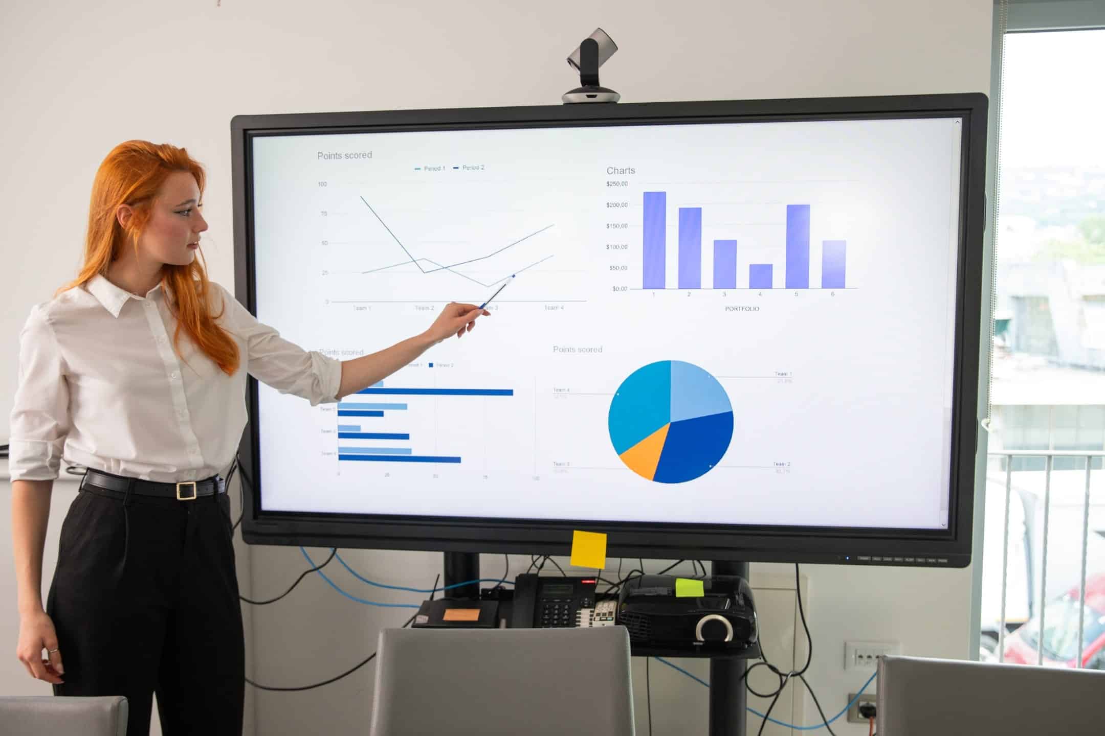
When applying Alternative Text, ensure the description is reflective of the authoring aims. If the intention of inserting a graph is to distinguish data comparison, then include the data within the description. If the writer’s aim is to present a chart to show an increase over time, however, the many individual data points over the course of years aren’t as relevant, ensure the description reflects the increase, with a condensed summary of the data. A sighted user can distinguish the level of importance of information within a graphic, based on the visual structuring. A non-sighted user relies on appropriate alternative text. If looking to exercise auto-generated text options, a thorough read through/quality control inspection of the description should always be executed.
Creating Accessible Transitions and Animations
Transitions and Animations are not typically recommended when strengthening a presentation’s accessibility. When it comes to transitions and animations, if they are implemented, simple is best. Consider the speed, level of complexity, and if layering is involved when questioning appropriate choices for presenting the slide information. Difficulties can present with assistive technology in these cases and distractions within the animations can decrease comprehension of the information in the presentation.
Utilising PowerPoint’s Accessibility Checker
The Accessibility tab in PowerPoint should be part of the authoring process from the beginning. Having the Check Accessibility validator open while working through the file can assist in catching inaccessible items and allowing adjustments within the creation process.
PowerPoint’s accessibility checker provides a base for identifying common accessibility issues (colour contrast, missing titles, reading order warnings, Alternative Text flags), ensuring compliance with standards. Error, Warning, Tip details and recommendations through validators highlight issue elements on the slides, prompting attention to key accessibility drawbacks in a presentation.
Conclusion
Adapting accessibility features in PowerPoint creation processes is a powerful step toward making content inclusive and accessible to everyone. By ensuring your presentations are accessible, you’re enhancing the reach and effectiveness of your work, making a positive difference in the lives of all your audience members.