Introduction
Web accessibility best practises are a crucial component of modern web design, ensuring that everyone, can access and navigate online content effectively. Prioritizing accessibility improves the user experience for all users, not just those with disabilities, leading to better engagement and broader reach. Creating accessible websites is not only a legal requirement but also a step toward inclusivity, benefiting businesses and users alike.
In this guide, we will focus on best practices for making key web components—forms, menus, and other interactive elements—accessible. These areas are integral to user interaction and need special attention to ensure an inclusive digital experience.
Understanding Web Accessibility
Web accessibility refers to designing websites, tools, and technologies that are usable by everyone, including people with disabilities. By making web content accessible, developers can cater to the needs of a wider audience, improving usability and user satisfaction.
Several standards and laws govern web accessibility. The Americans with Disabilities Act (ADA) in the United States ensures that digital platforms are accessible to users with disabilities. The Web Content Accessibility Guidelines (WCAG), developed by the World Wide Web Consortium (W3C), provide an international framework for accessible design, emphasizing principles like perceivability, operability, understandability, and robustness.
Accessible Forms
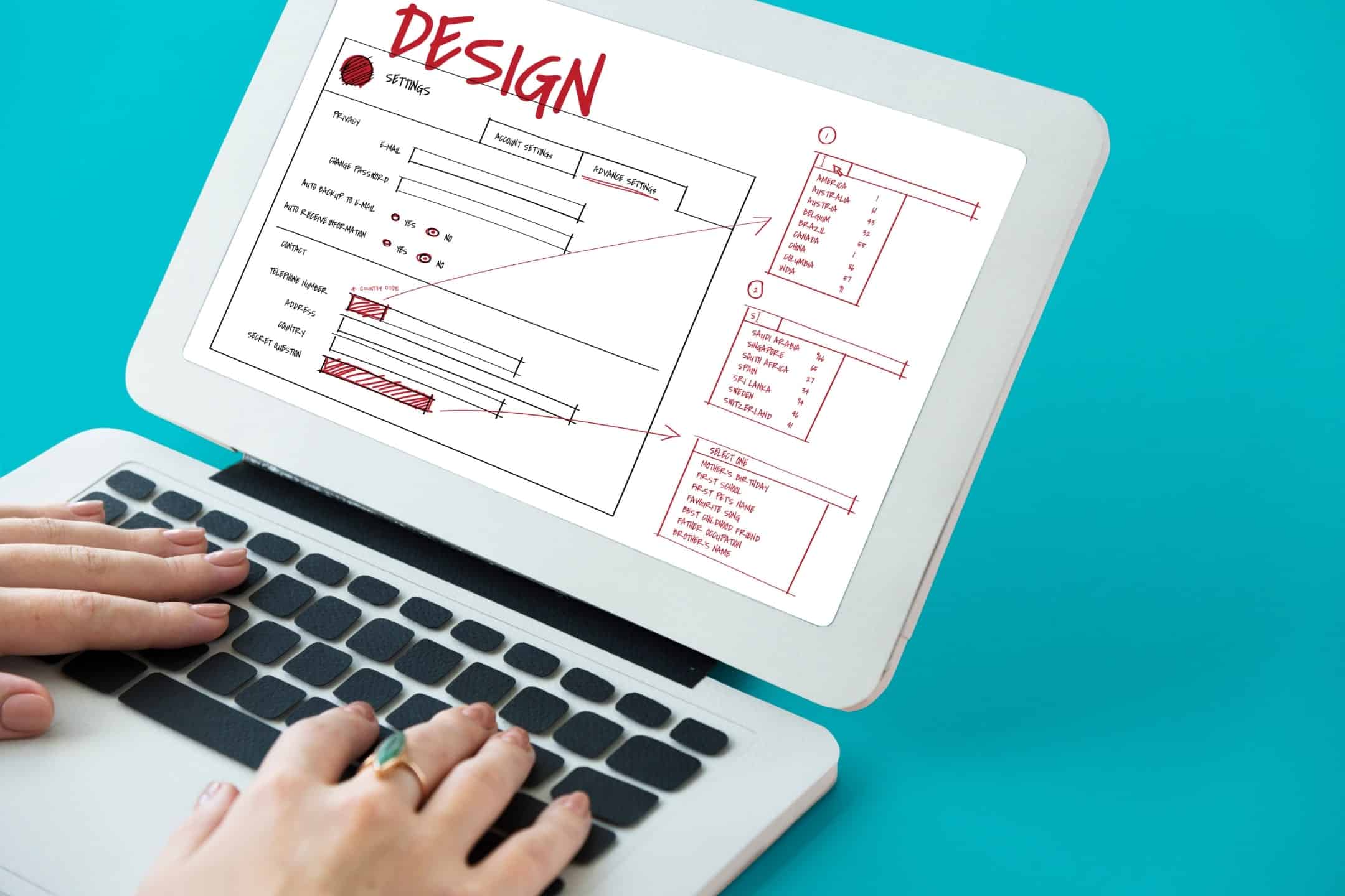
Forms are a fundamental part of many websites, whether for collecting contact information, processing purchases, or facilitating user registration. Ensuring that forms are accessible is key to providing an equitable online experience for all users, including those who rely on screen readers, keyboard navigation, or other assistive technologies.

Best Practices for Designing Accessible Forms
- Clear Labeling and Instructions: All form fields should have clearly associated labels to inform users of their function. Screen readers use these labels to communicate the purpose of form elements, so associating them with the correct input fields is essential. For example, labeling a text field “First Name” provides clear context for users. Additionally, providing explicit instructions—such as indicating required fields or specific formats—makes forms easier to navigate and complete.
- Error Handling and Feedback: Accessible error messages are crucial to guiding users through the form submission process. Error notifications should be clear and easy to understand, using text and visual cues (not just color) to indicate errors. Moreover, error messages should be placed near the problematic field so that users know where to focus their attention. Automated error detection, such as identifying missing or incorrectly formatted fields, can further enhance the user experience.
- Keyboard Navigability: Many users rely on the keyboard to navigate forms, either due to mobility impairments or a preference for keyboard shortcuts. Ensuring that form fields are accessible via keyboard is vital. This includes establishing a logical tab order and making interactive elements, like checkboxes and radio buttons, keyboard-accessible. Providing a visible focus state (such as a border around the active field) helps users track their position in the form.
By following these best practices, developers can ensure their forms are not only functional but also accessible to a wide range of users, improving completion rates and user satisfaction.
Accessible Menus
Menus are central to website navigation, allowing users to move between pages and access key content. Accessible menus ensure that all users, including those with disabilities, can easily navigate the website without confusion or frustration.
Techniques for Creating Accessible Menus
- Logical Structure and Organization: Structuring menus in a logical, hierarchical manner makes them easier to navigate. Use simple HTML markup to define menus and submenus, keeping the code clean and straightforward. This allows screen readers and assistive technologies to easily interpret the menu structure and provide the correct context to users.
- Keyboard Accessibility: Like forms, menus must be navigable using a keyboard. Users should be able to move between menu items using the arrow keys and activate selections with the “Enter” or “Space” key. Dropdowns should expand and collapse with keyboard controls, providing a smooth and intuitive experience for all users.
- Focus on Visibility and Readability: Menus must be easily visible and readable, particularly for users with low vision or colorblindness. Use high-contrast colors to differentiate between menu items and ensure that the text is large and clear. Visual indicators, such as underlines or bolding, can help users identify which item is currently selected or focused.
While ARIA roles can be helpful for improving accessibility in some cases, simpler techniques like proper HTML semantics and clean structure often suffice. Ensuring that your menus are usable and visible is key to delivering an accessible navigation experience.
Interactive Web Elements
Interactive elements, such as buttons, sliders, and pop-up modals, enhance user interaction but can present accessibility challenges if not designed properly. Ensuring these elements are accessible is crucial for delivering an inclusive experience.
Web Accessibility Best Practices for Interactive Elements
- Simplicity in Design: Wherever possible, interactive elements should be designed with simplicity in mind. For example, using standard HTML buttons instead of custom-designed interactive elements ensures that these buttons are inherently accessible and easy to interact with. Avoid using non-standard controls for elements like sliders, as these can be difficult to operate for users relying on keyboard navigation or assistive technologies.
- Clear Focus Management: When users interact with dynamic elements like pop-up modals, it’s important to manage the focus properly. When a modal opens, the focus should automatically shift to the modal content, allowing users to interact with it without being distracted by background elements. Once the modal is closed, focus should return to the button or link that triggered it. This ensures a smooth user experience and prevents confusion.
- Visual Cues and Indicators: Interactive elements should provide clear visual cues, indicating which elements are clickable or interactive. For example, buttons should change appearance when hovered over or focused, and sliders should have clear visual markers indicating their current position. These cues help users, particularly those with visual impairments, understand how to interact with dynamic content.
Testing these elements using common assistive technologies like screen readers, voice control software, and keyboard-only navigation tools is essential. Testing ensures that the elements behave as expected for all users and comply with accessibility guidelines.
Conclusion
Incorporating accessibility into forms, menus, and interactive elements is crucial for creating an inclusive and user-friendly web environment. By following best practices like ensuring keyboard navigability, using clear labels, and providing visible focus indicators, developers can enhance the accessibility of their websites and improve the experience for all users.
Web developers and designers are encouraged to implement these best practices to ensure their websites comply with ADA and WCAG standards while offering an improved user experience. For more information on accessible design, explore our additional resources or contact us to ensure your site is accessible to everyone. Embrace accessibility as a way to create a more inclusive digital world.


